Transition
어떤 상태에서 다른 상태로의 변화를 애니메이션으로 만드는 방법
transition 속성은 state가 없는 엘리먼트에 추가해서 사용해야 한다.
위의 go home에 마우스를 올려보면 상태 변화가 애니메이션처럼 나타나는 데 transition 속성을 이용하여 만든 것이다.
<!DOCTYPE html>
<html lang="kr">
    <head>
        <title>Home - My first website</title>
        <style>
            .forTest {
                color: wheat;
                background-color: tomato;
                text-decoration: none;
                padding: 3px 5px;
                border-radius: 5px;
                font-size: 55px;
                transition: all 1s ease-in-out;
                /* transition: background-color 1s ease-in-out,
                color 1s ease-in-out,
                border-radius 1s ease-in-out; */
            }
            .forTest:hover {
                border-radius: 20px;
                color: tomato;
                background-color: wheat;
            }
        </style>
    </head>
    <body>
        <a class="forTest" href="#">Go home</a>
    </body>
</html>
아까 위에서 말한 transition은 state가 없는 곳에서 작성해야 한다는 말을 위의 코드를 보면 이해가 될 것이다. transition으로 바꿀수 있는 것은 원래의 엘리먼트와 :hover state가 있는 엘리먼트 두 곳에 모두 존재하는 속성들(여기서는 border-radius, color, bg-color)이다. 주석한 부분이 transition을 사용하는 방법이고 저렇게 전부를 바꿀 때에는 주석하지 않은 코드처럼 all 시간 ease-in-out 이런식으로 작성하면 똑같이 동작한다. 3번째 인자는 ease in function이라고 불리고 기본적으로 브라우저에게 애니메이션이 어떻게 변할지 알려주는 역할을 한다(빠르게 변한다던지 천천히 변한다던지 등등).
Transformation
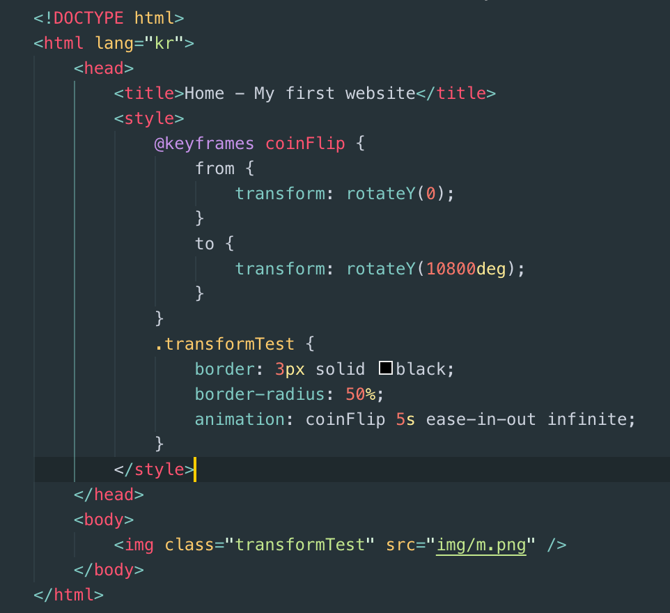
말 그대로 한 요소를 변형시킬 수 있다. 니콜라스는 img를 예시로 보여주었다. transform도 많은 함수가 존재하고 이를 위에서 배운 transition과 함께 사용한 예시만 남겨두고 넘어가도록 하겠다.
<!DOCTYPE html>
<html lang="kr">
    <head>
        <title>Home - My first website</title>
        <style>
            .transformTest {
                border: 3px solid black;
                border-radius: 50%;
                transition: transform 2s ease-in-out;
            }
            .transformTest:hover {
                transform: translate(100px) rotateY(360deg) scale(0.5);
            }
        </style>
    </head>
    <body>
        <img class="transformTest" src="img/m.png" />
    </body>
</html>

이미지는 보이지 않겠지만 마우스를 올려놔 보자!!
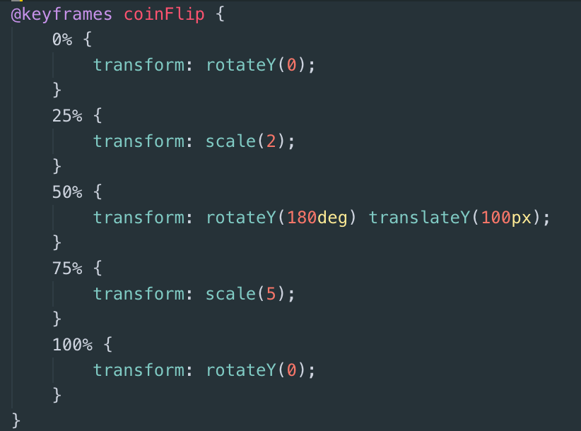
Animaiton
animation의 기본적인 사용법이다. @keyframes를 통해 하나의 엘리먼트(coinFlip)를 만들고 from ~ to로하여 지정을 해놓은 후 다른 엘리먼트에서 animation 속성을 통해 사용하면 마우스를 갖다 대지 않아도 상태변화하는 애니메이션을 만들 수 있다.
from과 to 대신 0%~100% 사이의 숫자를 selector로 사용하여 조정을 할 수도 있다.
Media query
오직 css만을 사용해서 사용자의 스크린 사이즈를 알 수 있는 방법이다.

미디어 쿼리는 기본적인 사용법만 작성해놓고 CSS 조금 더 깊게 맛보기를 마치도록 하겠다.
'Study > ft_transcendence' 카테고리의 다른 글
| [React] 22.07.12 회고록 (0) | 2022.07.12 |
|---|---|
| [React] 22.07.11 회고록 (0) | 2022.07.11 |
| [CSS] CSS 맛보기 (노마드코더) (0) | 2022.06.14 |
| [Html] html 맛보기(노마드 코더) (0) | 2022.06.07 |
| [UI / UX] UI 와 UX 란? (0) | 2022.06.06 |


댓글